 by Leslie Patterson
Sifting through decorating and design magazines is a favorite pastime of new homeowners.
View this House Plan
View Other Traditional House Plans
Each desires to outfit their new dream home with unique decor that is both elegant and inviting. There is flooring to install, furniture to pick out and arrange, and walls to be painted. However, before any of these tasks can be accomplished, a decision must be made: what is the color scheme?
Each room in your home has a different purpose and will most likely have a different color scheme. For example, a brilliant orange in the kids' playroom is not as appropriate in the spa-like master bath. In order to determine what colors should be applied to your living spaces, you must first have a basic knowledge of color:
- Primary Colors – Those three colors learned at a young age are the foundation of the color wheel – red, blue, and yellow.
- Secondary Colors – These are the colors that emerge once the Primary colors have been combined – purple, orange, and green.
- Tertiary Colors – The last spokes of the color wheel are made when each of the Secondaries mixes with their neighboring Primary.
- Cool Colors – Blues, greens, and purples make up the "cool" side of the color wheel. These colors are passive and recede into the background, often making rooms appear larger. Cool colors are ideal for home offices, bedrooms, and other living spaces that require peace and calm. Greens are especially rejuvenating, so strategically placed houseplants can provide a splash of color while maintaining a room's balance.
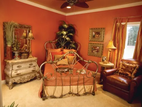
- Warm Colors – Reds, yellows, and oranges make up the other half of the color wheel, invigorating living spaces. These are active colors that appear to move toward you and transform rooms into intimate settings. These colors can be distracting, so it is best to use them in creative spaces like playrooms and kitchens. Using them as accents for home offices can keep workspaces from being dreary while retaining productivity.
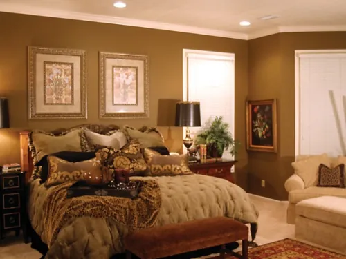
- Whites & Neutralizers – Although not considered part of the color wheel, do not overlook the important place whites and neutrals have in your home decorating. Whites promote an open feeling when used in large quantities. Utilized as accents, whites provide crisp frames that showcase other colors. For the walls, turn to soft, muted whites to prevent eyestrain caused by light reflecting off brilliant whites. Neutralizers are those soft hues of tan and cream that bridge rooms together. Cooperative and not distracting, neutralizers blend with all other colors to keep schemes cohesive.
View this House Plan
View Other Country House Plans
Now that you are familiar with the color wheel, there are many ways to approach choosing a color scheme. Consider the following methods, focusing on which option works in your home:
- Monochromatic – Single color schemes are not as boring as one may imagine. Using various shades from the same color family creates a harmonious color scheme that is easy on the eye and simple to utilize.
- Analogous – To use analogous (similar) colors for a color scheme, begin by selecting your favorite color from the wheel. Then look at the neighbors on either side. If you like only one of the neighboring colors, look at what color is on its other side. When you find three to five consecutive wheel colors that appeal to you, then you have determined your color scheme. Analogous colors are richer than monochromatic schemes, but no more difficult to create.
- Complementary – Like choosing an analogous scheme, begin by selecting your favorite color. Then look for the color directly opposite on the color wheel. These two colors are natural complements – one will be a warm color (red, yellow, orange hue) and the other cool (blue, purple, green). The favorite color should be dominant in your scheme while the complement serves as an accent. Though more difficult to balance, complementary colors create a very dynamic color scheme.
- Split Complementary – Again, select your dominant (favorite) color then determine the two colors adjacent to its complementary. Using these three colors is slightly less rigid than the complementary scheme, but is just as vibrant. This scheme often works best when the warm color is dominant.
- Triadic – For a triadic approach, select three colors that are spaced equally in the color wheel. This scheme presents brilliant contrasting colors without being as dramatic as the complementary schemes. Often applied in home decor, one color is used in larger amounts than the others.
While selecting one of the above to help determine a color scheme, keep in mind the things being moved into your new dream home. You want to be certain the new colors will not clash with already owned furniture and linens. If you want the color scheme to be something completely different from your old home, but new furniture is not in the budget, look for new slipcovers or do-it-yourself re-upholstery.
Remember that perceptions of color are linked to your emotions and experiences – any color can match another, depending on the person selecting them. The most important part of the color selection process is determining what you love. Search through those design magazines, seek professional advice, and in the end, go with your gut. Now that you know the basics on selecting colors, that dream decor can soon be yours.
Here are some related articles:
Save this article to:
back to top